Why we built Sprinty’s interface on IBM’s Carbon Design System
Why we chose Carbon, IBM’s open-source design system, for Sprinty, a project management tool for agencies: what we tried first, what we kept and the trade-offs.
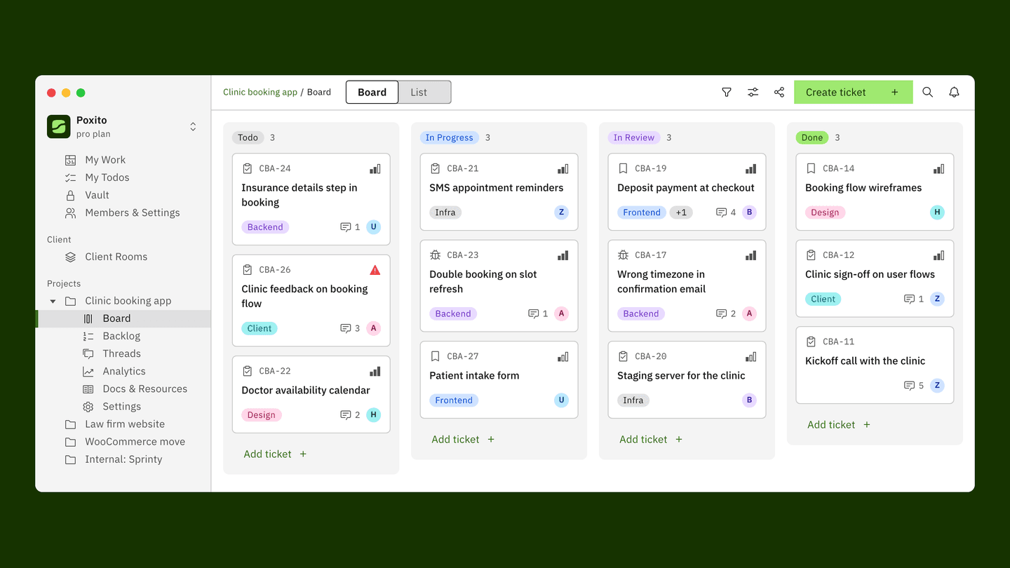
Sprinty is a project management tool for agencies, and its website now runs on Carbon, IBM’s open-source design system. This post is about why we chose Carbon, what we tried before it, what we kept our own, and what it cost us.
“Very vibecoded”
We showed sprinty.app to someone, and his first reaction was: “very vibecoded”.
He had a point. The tags, the badges and the generic styling inside the product looked AI-made, and for a tool agencies trust with their clients’ work, that’s the wrong first impression.
What we tried first
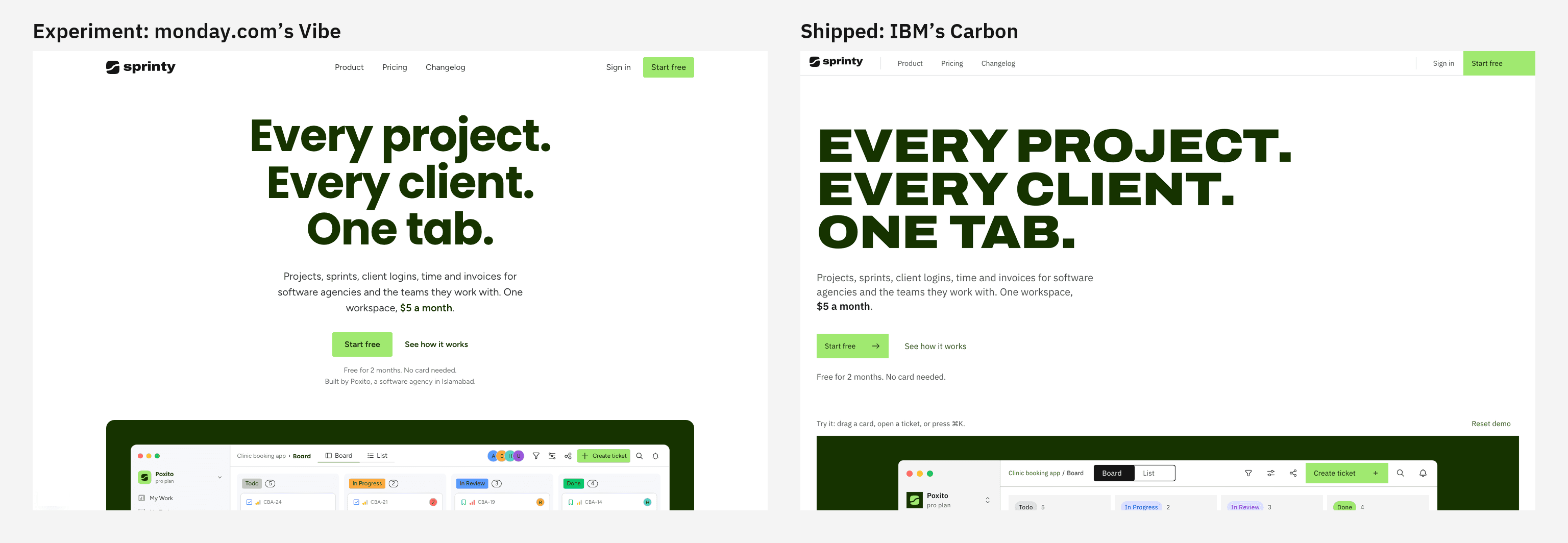
Our first attempt was a custom design direction inspired by Wise.
Then we built an experiment with monday.com’s Vibe design system. Vibe looked friendly. The problem was that it made Sprinty look too much like monday, and monday is in our own category. A project management tool that looks like another project management tool gives people one more reason to pick the original.
Why we chose Carbon
Carbon is IBM’s open-source design system. Five things decided it for us:
- It’s open source, under the Apache 2.0 licence.
- It’s built for dense work tools. Tables, tags and side panels are exactly what a project management tool is made of, and Carbon treats them as first-class components, not afterthoughts.
- It’s accessibility tested.
- It has light and dark themes.
- It’s themable with tokens. Every colour is a named token, so Carbon carries Sprinty’s lime and forest instead of IBM blue.
That last point is what made it work for us. If you’re looking for a design system for SaaS and worry that adopting one means looking like its owner, tokens are the answer. We didn’t restyle a single Carbon component. We changed the values behind them.
How our tokens map onto Carbon
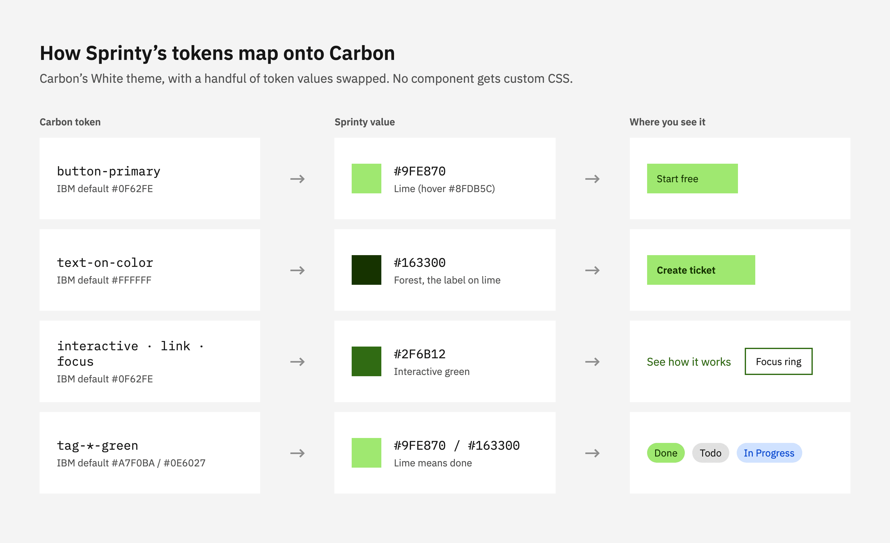
We start from Carbon’s White theme and override a handful of tokens: the primary button becomes lime with forest text, links, focus and other interactive elements become our interactive green, and Carbon’s green tag becomes our Done tag.
The board on our homepage is built from these components: Carbon tags for every status and label, Carbon icons, Carbon’s tile, breadcrumb, search and modal. This is where the change shows most.
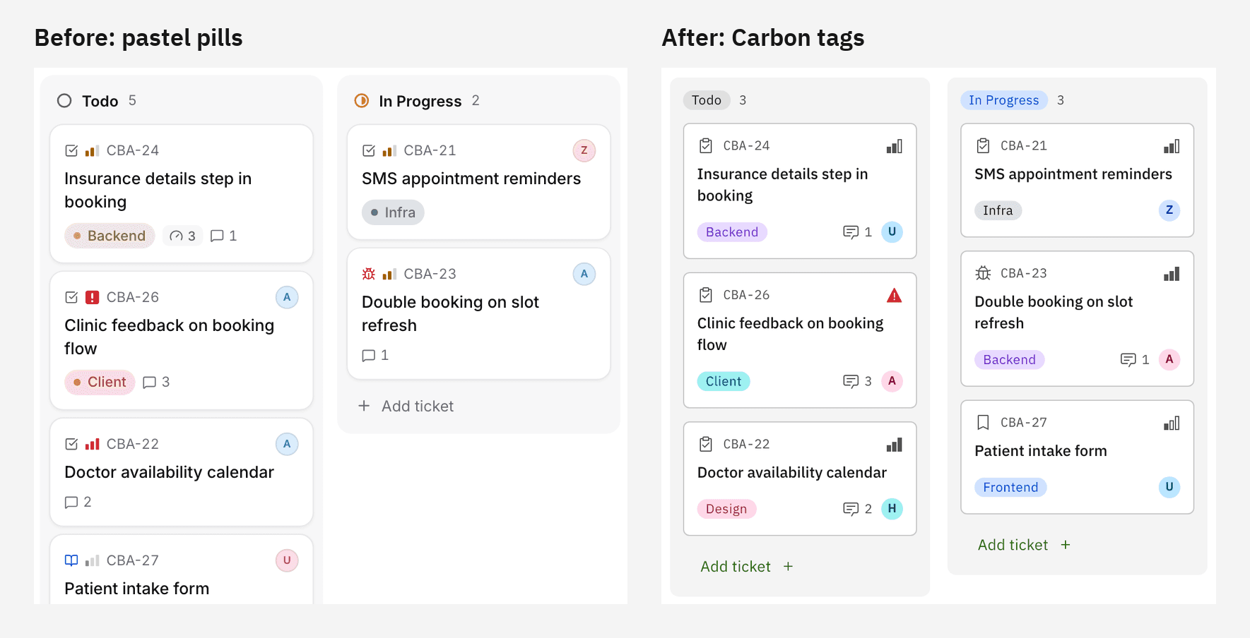
For anyone evaluating the Carbon design system for React: we use Carbon’s React components and icons as they ship, set the theme in one Sass file, and keep our own CSS to page layout around them.
What we kept our own
Carbon gives us the system. These stay Sprinty’s:
- The lime and forest brand. It lives in the tokens, so it’s everywhere Carbon is.
- The Archivo hero headline. “Every project. Every client. One tab.” is still set in Archivo, in heavy capitals. It’s the one place on the page that isn’t Carbon.
- Lime means “done”. Lime is the primary button and the Done status, and nothing else. When you see lime on a board, the work is finished.
The trade-offs
It wasn’t free.
- It’s more serious than before. Carbon is square-cornered and calm. Sprinty looks less playful than it did, and we think that’s right for a tool that holds client work, but it’s a real change in personality.
- The migration is real work. A design system only pays off when it’s used everywhere, and moving a whole product onto one takes time.
- Carbon is web-first. Its components are for the web, so our mobile apps reuse Carbon’s tokens rather than its components.
What’s next
The website is first. Next, we’re migrating the whole Sprinty app to Carbon, screen by screen. You can follow along in the changelog.
Sprinty is built on Carbon, IBM’s open-source design system. Carbon is made by IBM; Sprinty isn’t affiliated with or endorsed by IBM.